6 Tips for Effective Use of Visuals in Your Presentation

You have most probably noticed that in today's world, images have become must-haves for effective communication and conveyance of messages.
From social media posts, to marketing communications, and even sales presentations at the workplace, utilizing visuals in presentations is a great way to get your points across. Behavioral studies, brain scans, and eye movement tracking prove that visual content communicates more effectively with audiences.
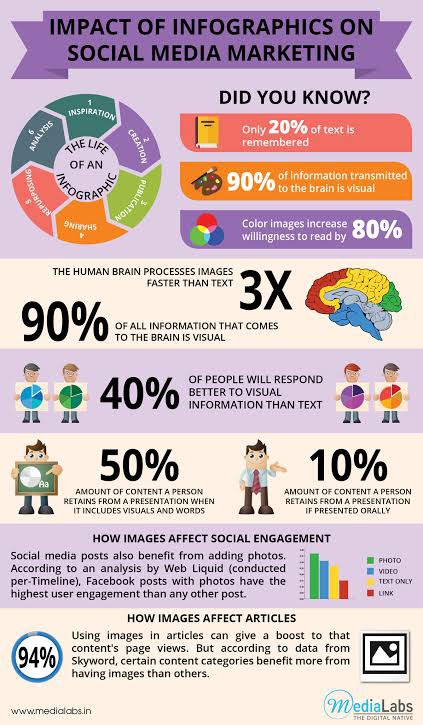
According to Social Samosa, people retain on average a whopping 50% of the content from a presentation when it includes visuals and words. Only 10% of content is retained if it is presented just orally.
The images you choose for your presentation, along with other graphical considerations such as fonts and colors, can assist your audience in understanding your message. This article will highlight six tips that you can use to effectively incorporate visuals in your presentations.
1. Be consistent
The art of public speaking has changed a lot since the days of stump speeches and public debates. Speaking to an audience now involves a lot more moving parts – from crafting a speech that resonates with your audience, to choosing the right visuals to accompany your speech.
Now that Zoom and other conferencing tools are available, knowing how to speak to the public in an online environment is no longer just optional – it is a skill that every speaker should master. Part of this skill involves recognizing patterns in images and using them to support your prepared speech.
The human brain understands patterns much faster than any other form of data presentation. The images you use should have these attributes of consistency:
-
Images that focus on and bring out the big idea of your presentation. Pick images which contribute to the main message, and don’t distract the audience from it.
-
Pictures with a similar color scheme and shot in a similar environment. This will lead to a consistent tone throughout your presentation. It will also prevent you from losing your audience’s attention as they focus on trying to decipher each image.
All the visuals in your presentation should appear to be part of the same family of artwork. This will strengthen your slideshow. A cohesive set of pictures will make it easier for the audience to understand your message. Additionally, consider choosing visuals that tell a story.
2. Use high-quality visuals
There is nothing more distracting than a blurry, overexposed or pixelated photo. On a web page, low-quality images affect SEO strategies by increasing the bounce rate. Whether it is a high-quality blog article or social media post, bad images will turn away your target audience. Low-quality images have a similar effect on presentations – your audience will likely look away instead of getting drawn in.
To protect your reputation before your audience, pick high-quality images to use. In a case where you have to expand the photo to fit the screen, check to see if you have lost image quality and that you haven’t distorted the aspect ratio of the original. Direct your audience's gaze to where your body text is. If the image has a person or arrow pointing in a certain direction, use that as a subtle visual cue to place your text where it is pointing to.

Source: Slide Team
Check out this screenshot of a template for visuals in a presentation. The ribbon at the top of the screen goes down and seems to point to the words “text slide” below it.
This clever image conveniently directs your gaze to the words “text slide” at the bottom of the ribbon, right? Exactly.
High-quality images give your presentation a crisp, clean look.
Should you be worried that the images you intend to use won’t be up to scratch, help is at hand. In fact, there are a couple of options available to you. If you’re a graphic design whiz, then it shouldn’t take you too long to tinker with your visual elements in your preferred editing software. If you’re not skilled in this arena, or you have limited time on your hands, using an AI image enhancer is a great option. This tech can swiftly transform low-res or imperfectly framed images into crystal-clear, carefully orchestrated creations that will impress anyone who sees your presentation.
Remember, even no images are better than bad images. But of course, we're here to learn how to use images to enhance our presentation, so this won’t apply to us.
3. Add images that align with your content
Wowing your audience with stunning graphics will rarely be the main aim of your presentation. You will normally use visuals to reinforce the main goal of your slideshow.
Take your time and choose images that amplify your message. Picking random pictures to fill empty spaces in your presentation will serve only to distract your audience.
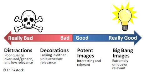
Images that first support your content and then add to the aesthetic of the slides are best for your slideshow. An image is your supporting staff and not the star of the show, as illustrated below.

Source: Powerpointninja.
In addition, consider visuals that seek an emotional connection from your audience. Such photos elicit a response from your listeners and emphasize specific points in your presentation in a similar way to using humor in your talk serves to lighten the mood and set up your audience for a point that you’d like to drive home.
4. Keep it simple
Keeping in mind that images serve to bolster the main message of each slide, check that the slides are readable and visible.
Picking a suitable simple yet powerful image, will support your presentation. In contrast, if you choose the wrong photo, you risk miscommunicating with your audience.
Here are a few pointers to keeping the visuals in your presentation simple:
-
How legible is your text? Chilibreeze explains that text should appear clearly against your chosen background image. Use readable, simple text for your body copy to make sure your audience does not struggle to read it.
-
Use text less and talk more – Have short bullet points on your slides that contain the keywords of your message. These serve as reminders of the main ideas for you to verbalize to your audience. Talk to your listeners while presenting, and not to the screen. Speaking to the screen implies that you’re afraid of speaking to the audience, which is something that you would need to address urgently.
-
The bigger the text, the better – Since there is brief text on each slide, let each word have room to breathe. Make sure to have a clear difference between the headlines and their supporting text by using various font sizes and maybe colors.
Visuals in your presentation are a great way to engage with your audience and retain their attention. Keep them glued to the screen with simple, engaging images.
5. Avoid clutter
Visuals in presentations add emotional resonance to your message and support your statements. The human brain can process images 3x faster than text.

Source: Media Lab
There is no need to fill every square inch of each slide. White space is relaxing, and your audience will like it more than full, overwhelming slides.
Display your images one at a time. This will help maintain the focus of your audience on your main idea. Too many images become distracting.
There may be instances where you need to use more than one visual to communicate one, unifying message. In such a case, here are a few points to consider:
-
Fit your images into a similar shape: If your images are of different sizes, use a binding element such as a grid. This will make the pictures appear tidy and well-fitted on your slide and will make them more understandable.
-
Use the same size and shape of photos: Whether you choose a square, circular or rectangular shape for your photo presentation, make them the same size to ensure the scannability of your slides.
-
Cluster, align and group your content – Evenly and consistently grouping the elements on your slide allows people to visually register the pattern and comprehend the information quicker. The simplest way to add groupings to slides is to have an image, a headline, and a descriptive body. Make sure to also align the elements of your slide along the X and Y axes.
Resist the temptation to fill your slides with objects or text. Your audience will thank you for it.
6. Check for copyright
Keep it legal. Have a proper license from the copyright holder before incorporating the images into your presentation. It is vital to give credit where it is due. Attribute the photos to the sources from which you obtained them. Avoid using watermarked images. They make your presentation look like they were ripped off from another source. You can get photos without these marks by obtaining them legally.
If you do not have the budget to purchase stock images, consider using photos listed under the "Creative Commons" license. These are more open and can be used for commercial purposes as long as you credit the image creator.
One way to credit the content creator is to leave space at the bottom of your slides where you cite these sources. You could also have them on a final page where all attributions can be listed.
We all love to be acknowledged for the work we put so much effort into. It is only fair to do the same for others whenever we have the opportunity, and your presentation is a great chance to do so.
In closing
As the saying goes, a picture is worth a thousand words. It is definitely worth the digging that goes into finding the perfect one. A wrong choice of images could render even the most well-researched presentation useless, and hinder effective communication.
Pick high quality images for your presentation. They will give you a crisp, clean touch and make you look like the professional you are. Search for images that are consistent with your message. Your image should complement your main idea and not draw attention away from it.
Remember to keep it simple and avoid clutter. White space lets you frame your images and gives the viewer a chance to rest their eyes. At the same time, pick visuals that bolster the big idea of each slide and ensure that your text is easily readable against the image you have chosen. Lastly, check for copyright and acquire your images legally.
With all this in mind, you're on your way to having a killer presentation.
Daryl Bush is the Business Development Manager at Authority.Builders. The company helps businesses acquire more customers through improved online search rankings. He has extensive knowledge of SEO and business development.


