
Reading time:1 min read


In the age of analytics, being able to present data in a way that is engaging, valuable, and comprehensible can sift out the great speakers from the good. It can be the difference between sharing a message that resonates or falls flat and between being booked to speak again or not.
While you may know that the statistics, numbers, facts, and in-depth information is important for your audience to know, if you cannot make it enthralling, helpful, and fascinating, you run the risk of either boring or overwhelming your audience. Neither will help your message make an impact.
We’ve outlined 10 tips to keep in mind to help break down big data in a way that will help your audience understand and engage with your content in a productive and retainable way.
It’s easy to get caught up in the idea that you have been brought on stage to be brilliant: that you need to blow the audiences’ socks off with how much you know and how intelligent you are. But, a presentation given from this perspective rarely wins over the audience or makes a lasting impact.
Being relatable and down-to-earth makes your presentation more relevant and understandable.
Cut out the heavy jargon (need tips on how to do that? See the article “Reach more people: cut the jargon and speak for a broader audience”). Focus more on connecting with your audience than impressing them. This perspective switch will change your approach from being something large and impressive to comprehensive and helpful.
Making your presentation entirely about helping your audience will make you look better in the long run.

If you have a lot of complex information to share, you are going to need a good strategy.
While you might be tempted to just jump in and share everything you’ve got, this is not in your audience’s best interest. Instead of dumping all your data on them, build your data into a story or a message.
What do you want your audience to take away? What is the one thing you want them to remember? What is your key insight that is going to transform their approach? How are you helping them? Get the core of your message clear, then use your data to help tell that story.
Each fact, statistic, and number you share with them should add to your core message—cut anything that doesn’t help you weave your main message. This will help clear away a lot of the extra information that might overwhelm your audience.

If you are bored by your presentation, there is very little hope that your audiences will be engaged.
Bored equals boring.
You’ve got to find a way to get fired up about what you are sharing.
While you probably aren’t going to go all Tony Robbins on stage getting your audience to jump up, cheer, and shout out every time you say the word “percent”, you do need a way to light yourself up about what you are sharing.
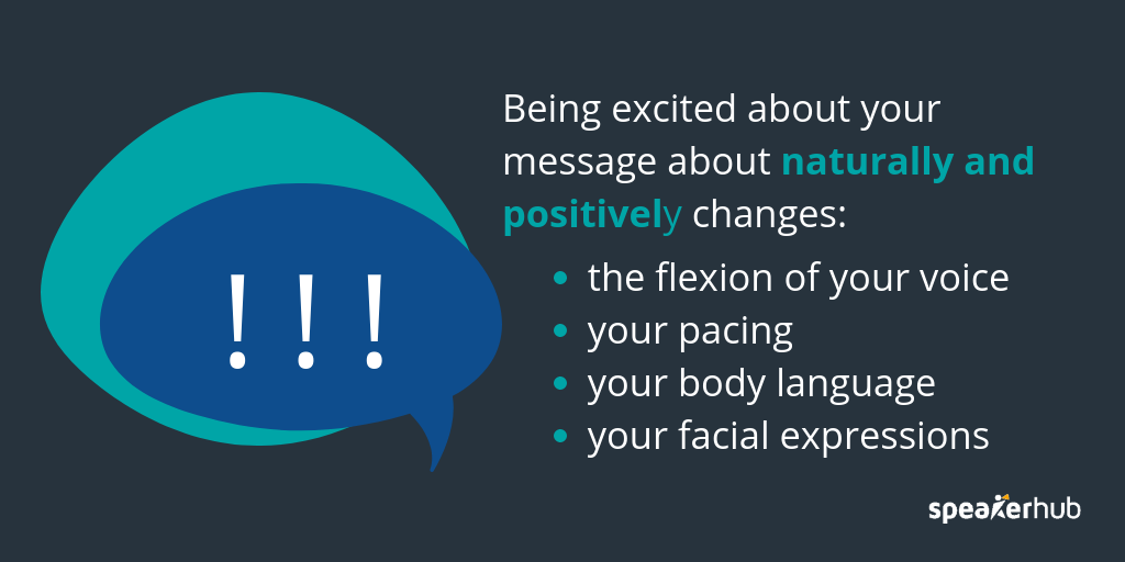
Being excited about your message will naturally have a positive change in the flexion of your voice, your pacing, your body language, and your facial expressions.
Speaking in a rigid and monotone voice, listing statistic after statistic (no matter how good those statistics are), will bore your audience and leave them aching for the door instead of wanting more.
Storytelling is key to making big data digestible.
We have a tendency to believe that cold hard facts make for more compelling content, and in order to prove something, you need straight statistics. Storytelling is fine for films but not for adeptly sharing key messages. This is a fallacy.
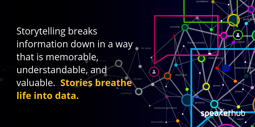
Storytelling breaks information down in a way that is memorable, understandable, and valuable.
Stories breathe life into data.
What do we mean when we say “storytelling”? We like Ira Glass’s definition:
“This happened, and that led to this next thing, and this next thing and so on; one thing following another. And some things in the sequence can be: then that made me think of this, and that made me say this.”
-Ira Glass, master storyteller and the host of NPR’s This American Life
Whether you are using a personal story, analogy, real-life example, or relevant joke, expressing and marrying the data to stories will help keep your talk relevant and interesting.
More on storytelling here: 8 Storytelling techniques to use on stage
Start each point off with a key insight, then use the data to support that instead of dropping a ton of data on the audience and hoping they walk away with something useful. In all likelihood, they won’t be able to make the clear connections you are assuming they will.
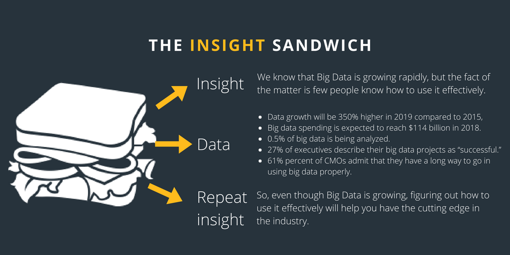
Use the “Sandwich Approach” by stating the insight, sharing the relevant pieces of data, then reiterating the insight. This will have a tremendous effect on how useful the data is to the audience members and what they end up taking away.

See this example:
Here are a handful of interesting statistics:
Data growth will be 350% higher in 2019 compared to 2015, according to the United Nations Economic Commission for Europe.
Big data spending is expected to reach $114 billion in 2018.
Only 0.5% of big data is being analyzed.
Only 27%t of executives describe their big data projects as “successful.”
61% percent of CMOs admit that they have a long way to go in using big data properly.
A clear insight is:
Big Data is growing rapidly, but few people know how to use it effectively
So, you could “sandwich” the data in insights like this:
We know that Big Data is growing rapidly, but the fact of the matter is few people know how to use it effectively.
Data growth will be 350% higher in 2019 compared to 2015, reaching an estimated spend of $114 billion this year.
This being said, only 0.5% of Big Data is being analyzed, and that which is being analyzed is not necessarily helping organizations: only 27% of executives describe their Big Data projects as “successful”, while 61% percent of CMOs admit that they have a long way to go in using Big Data properly.
So, even though Big Data is growing, figuring out how to use it effectively will help you have the cutting edge in the industry.
Instead of just reading all the statistics, make the information relevant and insightful.
Vague generalities are not very helpful when it comes to relaying complex data. Be as concise and specific as possible, and use your statistic to make an impact.
While you can give a lot of information and statistics, make sure you state it minimally, comprehensively, and briefly. This will help ensure that you don’t overwhelm the audience.
Write down everything you want to say, then edit it down to the bare minimum— removing the extra fluff.

When using the data to make your point, be specific.
Instead of saying, “Healthcare is one of the biggest industries in the United States,” say, “If our healthcare system were its own country, it would be the seventh largest economy in the world.”
This is likely to make a bigger impact on your audience, giving your message more memorability and impact.
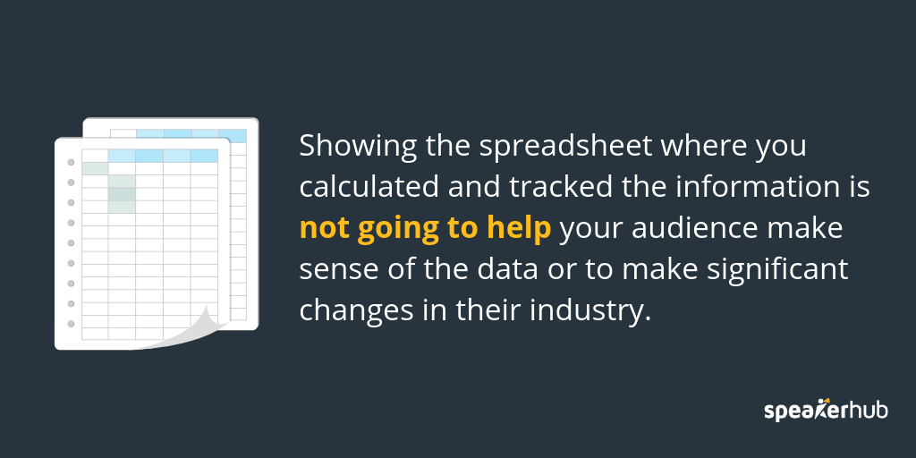
While we could have grouped this into the last point, we thought it was important enough to be a tip all on its own. Many presenters fall into the habit of displaying their spreadsheets even though it is not inspiring or helpful to audiences.
Spreadsheets are built to help you calculate and track your data, but think of them as your desktop.
While they are necessary to get the work done, seldom are they pleasant to look at, and rarely do they help audiences make sense of the work itself.
Part of your job as the presenter is to sort out the data and highlight the important, impactful information, and packaging it a way that is engaging and enticing.
Showing the spreadsheet where you calculated and tracked the information is not going to help your audience make sense of the data or to make significant changes in their industry.
While we are on the topic of visuals, let’s dive into it a bit more.
Humans are intrinsically visual, and as design permeates almost every aspect of our daily lives, it is important that you effectively use visuals to support your message.
Here are three tips for maximizing your visuals:
Drop the slides with bullets: put only one statistic per slide.
If you want to share a statistic, create a slide just for that statistic.
This works for a few reasons:
It creates a shareable image, and people can grab a snapshot of the statistic that impacts them.
it is clear and concise.
it keeps the audience focused on one thing. If you add 4 or 5 bullets to the slide, the audience will automatically start reading all the points instead of listening to you.
Chose a strong image over written data or a graph.


You can still offer your statistics, but the image of the city underwater is going to have a much bigger visual impact on your audience than the graph or text.
Hire a designer to visualize your stats.
If you plan on using the same statistic regularly, consider hiring a graphic designer to visualize your statistics. These visuals can not only be used in your presentation but are fantastic materials to share on social media as well— potentially helping you grow your audience and influence.
There are many places online to hire a designer on a budget, and many designers can turn over a project like this in a few days
Here are some options for hiring designer online:
When you are presenting complex data, always make the patterns and trends crystal clear. This will help your audience cut through the noise and determine what they should be focusing on for the future.
If you unload a lot of data onto your audience, they can quickly become overwhelmed as they try and make sense of what to do with the information.
On the other hand, if they don’t immediately see how the information is relevant to the future of their organization, they can become bored and distracted. If they can’t frame the information you are offering, they will mentally check-out.
Be clear about what the trends and patterns are. Then, add the data in to support what you are saying instead of giving the data and hoping the audience will make sense of trends and patterns themselves.
While you don’t want to downplay your information, you do want to make it as easy as possible to understand.
When you are creating your presentation, for every point make sure you include a section on practical advice or takeaways: things that the audience can start implementing to make a difference.
For the most part, while audiences might be mildly interested in your research and findings, the biggest impact you can make is offering them ways to put your information into practice: ways to make a difference in their business, industry, or the world.
Here is an example:
Say that you are talking about Artificial Intelligence (AI) to a group of technology experts in the security industry.
While you start with some statistics like 61% of top executives see opportunities for AI in their organizations, and that AI software market will be worth $59.8 billion globally by 2025.
Even if you add a beautiful visual to that information, without a practical take away, your presentation will miss the opportunity to make an impact.
Instead, offer the statistics then back them up with how they can apply the information (or learn more about it) like, “Now, there are lots of ways that AI can be incorporated in the security industry, but one of the major areas to explore is face-recognition for video surveillance.”
You can take your talk from interesting to impactful by clearly outlining what they can start doing right away to use the technology to make a difference
The important thing to remember is to keep practicing and improving your techniques. Make notes of what sections of your talk or presentation the audience tends to tune out during, and make constant tweaks to make your presentation stronger and stronger.
Set up a profile and get new speaking opportunities: Sign up for SpeakerHub here.
Popular Categories